Unity3D :创建复杂列表视图
推荐:将NSDT场景编辑器加入你的3D工具链
3D工具集:NSDT简石数字孪生
创建复杂列表视图
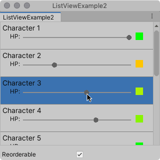
此示例演示如何创建复杂的列表视图。
示例概述
该示例创建一个包含字符列表的自定义编辑器窗口。每个字符都有一个滑块和一个调色板。移动滑块会更改调色板的颜色。
您可以在此 GitHub 存储库中找到此示例创建的已完成文件。
先决条件
本指南适用于熟悉 Unity 编辑器的开发人员,用户界面
工具包和 C# 脚本。在开始之前,请熟悉以下内容:
创建示例
此示例生成视觉元素
在 C# 脚本的列表中。它使用继承自 的自定义类,并将自定义元素绑定到对象。CharacterInfoVisualElementVisualElementCharacterInfo
- 使用任何模板创建 Unity 项目。
- 在项目窗口
,创建一个名为 的文件夹。Editor - 在该文件夹中,创建一个以以下内容命名的 C# 脚本文件:
EditorListViewExample.cs
using System;
using System.Collections.Generic;
using UnityEditor;
using UnityEngine;
using UnityEngine.UIElements;
public class ListViewExample : EditorWindow
{
// Gradient used for the HP color indicator.
private Gradient hpGradient;
private GradientColorKey[] hpColorKey;
private GradientAlphaKey[] hpAlphaKey;
// ListView is kept for easy reference.
private ListView listView;

// List of CharacterInfo items, bound to the ListView.
private List<CharacterInfo> items;
[MenuItem("Window/ListView Custom Item")]
public static void OpenWindow()
{
    GetWindow<ListViewExample>().Show();
}

private void OnEnable()
{
    SetGradient();

    // Create and populate the list of CharacterInfo objects.
    const int itemCount = 50;
    items = new List<CharacterInfo>(itemCount);
    for(int i = 1; i <= itemCount; i++)
    {
        CharacterInfo character = new CharacterInfo {name = $"Character {i}", maxHp = 100};
        character.currentHp = character.maxHp;
        items.Add(character);
    }

    // The ListView calls this to add visible items to the scroller.
    Func<VisualElement> makeItem = () =>
    {
        var characterInfoVisualElement = new CharacterInfoVisualElement();
        var slider = characterInfoVisualElement.Q<SliderInt>(name: "hp");
        slider.RegisterValueChangedCallback(evt =>
        {
            var hpColor = characterInfoVisualElement.Q<VisualElement>("hpColor");
            var i = (int)slider.userData;
            var characterInfo = items[i];
            characterInfo.currentHp = evt.newValue;
            SetHp(slider, hpColor, characterInfo);
        });
        return characterInfoVisualElement;
    };

    // The ListView calls this if a new item becomes visible when the item first appears on the screen,
    // when a user scrolls, or when the dimensions of the scroller are changed.
    Action<VisualElement, int> bindItem = (e, i) => BindItem(e as CharacterInfoVisualElement, i);

    // Height used by the ListView to determine the total height of items in the list.
    int itemHeight = 55;

    // Use the constructor with initial values to create the ListView.
    listView = new ListView(items, itemHeight, makeItem, bindItem);
    listView.reorderable = false;
    listView.style.flexGrow = 1f; // Fills the window, at least until the toggle below.
    listView.showBorder = true;
    rootVisualElement.Add(listView);

    // Add a toggle to switch the reorderable property of the ListView.
    var reorderToggle = new Toggle("Reorderable");
    reorderToggle.style.marginTop = 10f;
    reorderToggle.value = false;
    reorderToggle.RegisterValueChangedCallback(evt => listView.reorderable = evt.newValue);
    rootVisualElement.Add(reorderToggle);
}

// Sets up the gradient.
private void SetGradient()
{
    hpGradient = new Gradient();

    // HP at 0%: Red. At 10%: Dark orange. At 40%: Yellow. At 100%: Green.
    hpColorKey = new GradientColorKey[4];
    hpColorKey[0] = new GradientColorKey(Color.red, 0f);
    hpColorKey[1] = new GradientColorKey(new Color(1f, 0.55f, 0f), 0.1f); // Dark orange
    hpColorKey[2] = new GradientColorKey(Color.yellow, 0.4f);
    hpColorKey[3] = new GradientColorKey(Color.green, 1f);

    // Alpha is always full.
    hpAlphaKey = new GradientAlphaKey[2];
    hpAlphaKey[0] = new GradientAlphaKey(1f, 0f);
    hpAlphaKey[1] = new GradientAlphaKey(1f, 1f);
    hpGradient.SetKeys(hpColorKey, hpAlphaKey);
}

// Bind the data (characterInfo) to the display (elem).
private void BindItem(CharacterInfoVisualElement elem, int i)
{
    var label = elem.Q<Label>(name: "nameLabel");
    var slider = elem.Q<SliderInt>(name: "hp");
    var hpColor = elem.Q<VisualElement>("hpColor");
    slider.userData = i;
    CharacterInfo characterInfo = items[i];
    label.text = characterInfo.name;
    SetHp(slider, hpColor, characterInfo);
}

private void SetHp(SliderInt slider, VisualElement colorIndicator, CharacterInfo characterInfo)
{
    slider.highValue = characterInfo.maxHp;
    slider.SetValueWithoutNotify(characterInfo.currentHp);
    float ratio = (float)characterInfo.currentHp / characterInfo.maxHp;
    colorIndicator.style.backgroundColor = hpGradient.Evaluate(ratio);
}

// This class inherits from VisualElement to display and modify data to and from a CharacterInfo.
public class CharacterInfoVisualElement : VisualElement
{
    // Use Constructor when the ListView uses makeItem and returns a VisualElement to be
    // bound to a CharacterInfo data class.
    public CharacterInfoVisualElement()
    {
        var root = new VisualElement();

        // The code below to style the ListView is for demo purpose. It's better to use a USS file
        // to style a visual element.
        root.style.paddingTop = 3f;
        root.style.paddingRight = 0f;
        root.style.paddingBottom = 15f;
        root.style.paddingLeft = 3f;
        root.style.borderBottomColor = Color.gray;
        root.style.borderBottomWidth = 1f;
        var nameLabel = new Label() {name = "nameLabel"};
        nameLabel.style.fontSize = 14f;
        var hpContainer = new VisualElement();
        hpContainer.style.flexDirection = FlexDirection.Row;
        hpContainer.style.paddingLeft = 15f;
        hpContainer.style.paddingRight = 15f;
        hpContainer.Add(new Label("HP:"));
        var hpSlider = new SliderInt {name = "hp", lowValue = 0, highValue = 100};
        hpSlider.style.flexGrow = 1f;
        hpContainer.Add(hpSlider);
        var hpColor = new VisualElement();
        hpColor.name = "hpColor";
        hpColor.style.height = 15f;
        hpColor.style.width = 15f;
        hpColor.style.marginRight = 5f;
        hpColor.style.marginBottom = 5f;
        hpColor.style.marginLeft = 5f;
        hpColor.style.backgroundColor = Color.black;
        hpContainer.Add(hpColor);
        root.Add(nameLabel);
        root.Add(hpContainer);
        Add(root);
    }
}

// Basic data class used for a character, with a name and HP data. Use a list of CharacterInfo as
// a data source for the ListView. The CharacterInfo can be bound to CharacterInfoVisualElement when needed.
[Serializable]
public class CharacterInfo
{
    public string name;
    public int maxHp;
    public int currentHp;
}
}
4. 若要查看示例,请从菜单中选择“窗口”>“列表视图自定义项”。
由3D建模学习工作室整理翻译,转载请注明出处!